
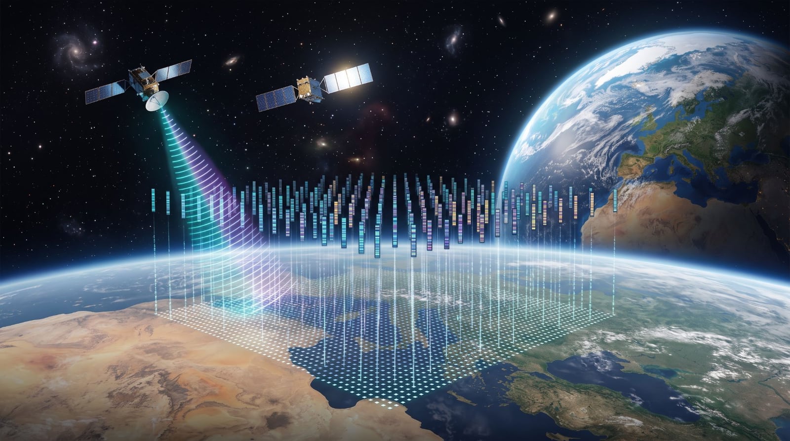
Suppose every 10 × 10 m patch of land had a short numerical fingerprint describing what it looked like, and how it behaved, over a whole year. Then many hard questions become simple arithmetic. Is this pixel water or land? Where else looks like this tea field? When did this hillside turn into a railway?
That is what TESSERA gives you. I have been using it to map Kenya, and this article covers what I learned: what TESSERA is, how it compares with the alternatives, the traps I ran into, and one use case worked through in detail.
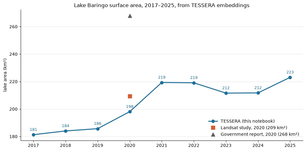
The chart above is where we will end up: the surface area of Lake Baringo, a lake in Kenya's Rift Valley that has been flooding the land around it, measured every year from 2017 to 2025. I trained no model and used no labelled data to make it.
What is TESSERA?
TESSERA (Temporal Embeddings of Surface Spectra for Earth Representation and Analysis) is a geospatial foundation model from the University of Cambridge [1]. The paper was accepted at CVPR 2026.
The problem it solves
Satellites don't give you a clean picture of the ground. Clouds hide optical images for weeks at a time. Orbits mean each place is seen on a different schedule. The usual fix is to merge a season's images into one cloud-free "composite", but that throws away the thing that often matters most: how the ground changes through the year. A maize field and a grassland can look alike in a single July image. They look completely different over twelve months.
How it works, briefly
TESSERA looks at one pixel at a time, across a whole year:
- Sentinel-2 optical time series (10 spectral bands), which shows colour, vegetation and water.
- Sentinel-1 radar time series, which sees through clouds and responds to surface texture and moisture.
Two Transformer encoders, one for each sensor, read these irregular, cloud-gapped series. A small network fuses their outputs into a 128-number vector. The model was trained with self-supervised learning (Barlow Twins): it learned by making its output stable when it sees different random subsets of the same pixel's observations. It needed no human labels [1].
The result is an embedding: 128 numbers per 10 m pixel per year. Pixels that behave alike over the year end up with similar embeddings. So you can compare places with basic vector maths, most often cosine similarity.
What you actually download
This is what makes TESSERA practical. You don't run the model. The Cambridge team has already run it and publishes the results [2]:
- Tiles of 0.1° × 0.1° (about 11 × 11 km), each one an array of
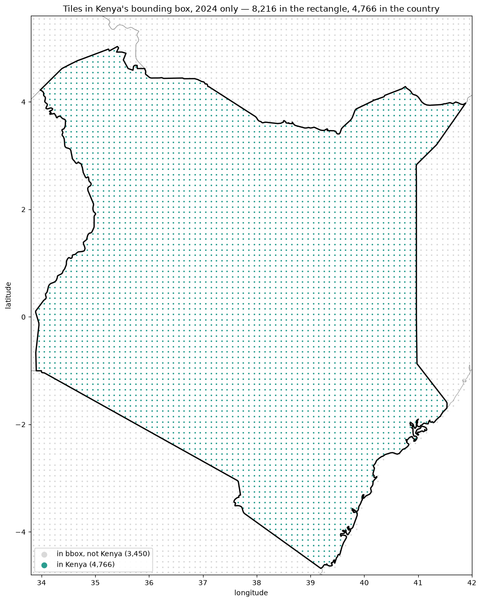
height × width × 128. - Coverage: global for 2024, and 2017–2025 for many regions. I checked Kenya: all 4,766 tiles covering the country have all nine years, with no gaps.
- Format: quantised to int8 with a scale factor. One tile for one year is still about 163 MB, so all of Kenya for all years is roughly 7 TB. Download only what you need.
- Licence: the embeddings are released under CC0 and the code under MIT [2][3].
- Access: the
geotesseraPython library, which downloads tiles on demand and caches them [2].
Here is the whole idea in about 20 lines. This code separates water from land on one Lake Baringo tile. I explain the method in the use case below.
import numpy as np
from geotessera import GeoTessera

gt = GeoTessera(dataset_version="v1", dataset_variant="vultr")

def tile(lon, lat, year):
    """One 0.1-degree tile as a (height, width, 128) array."""
    *_, emb, crs, transform = next(iter(gt.fetch_embeddings([(year, lon, lat)])))
    return emb

def unit(v):
    """Scale vectors to length 1, so a dot product is cosine similarity."""
    n = np.linalg.norm(v, axis=-1, keepdims=True)
    return np.divide(v, n, out=np.zeros_like(v), where=n > 0)

def reference(lon, lat, year=2024):
    """The average fingerprint of a tile we are sure about."""
    return unit(unit(tile(lon, lat, year).reshape(-1, 128)).mean(0))

water = reference(33.95, -1.05)   # open Lake Victoria
land = reference(36.85, -1.25)    # central Nairobi

for year in (2017, 2025):
    emb = unit(tile(36.05, 0.65, year))        # a tile on Lake Baringo
    is_water = (emb @ water) > (emb @ land)
    print(year, f"{is_water.mean():.1%} of the tile is water")

# 2017 64.5% of the tile is water
# 2025 66.6% of the tile is water
How TESSERA compares with the alternatives
TESSERA isn't the only option, and readers usually ask about the others. The most useful distinction is between embeddings someone has already computed and models you run yourself.
Precomputed embeddings (download and use):
- TESSERA (Cambridge): 128 numbers per 10 m pixel per year, from Sentinel-1 and Sentinel-2. Downloaded as files through
geotessera. Open data (CC0). - AlphaEarth Foundations (Google DeepMind): 64 numbers per 10 m pixel per year, from optical, radar, lidar and climate data, released as the Satellite Embedding dataset with annual layers from 2017 [4][5]. It's used mainly through Google Earth Engine.
Foundation models you run yourself on imagery:
- Prithvi-EO-2.0 (NASA, IBM and partners): trained on Harmonized Landsat–Sentinel-2 data at 30 m, and usually fine-tuned for a task [6].
- Clay (open source): a Vision Transformer that accepts many sensors, resolutions and band combinations [7].
Running a model gives you more control but costs compute and engineering time. Precomputed embeddings give you a head start: the heavy processing is done, and your analysis can be a dot product. TESSERA and AlphaEarth are the two main options in that second group. Researchers have already begun comparing them head to head on tasks such as urban climate-zone mapping [8].
Three ways to use embeddings
Over a series of notebooks on Kenya, I found that almost everything falls into one of three patterns. Each result below is from my own experiments [9].
1. Compare: ask "is this more like A or like B?" Take a reference embedding for each thing you care about, then score every pixel against them. No training at all. This is the Lake Baringo use case below.
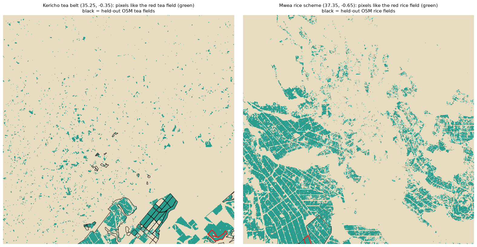
2. Search: ask "where else looks like this?" Take the embedding of one place you know and find every pixel similar to it. From a single tea field near Kericho (0.2 km²), this found 59% of 51 held-out tea fields mapped in OpenStreetMap. It flagged almost nothing in 32 other tiles of forest, savanna, desert, city and other farmland. A single rice field traced the paddies of the Mwea irrigation scheme.
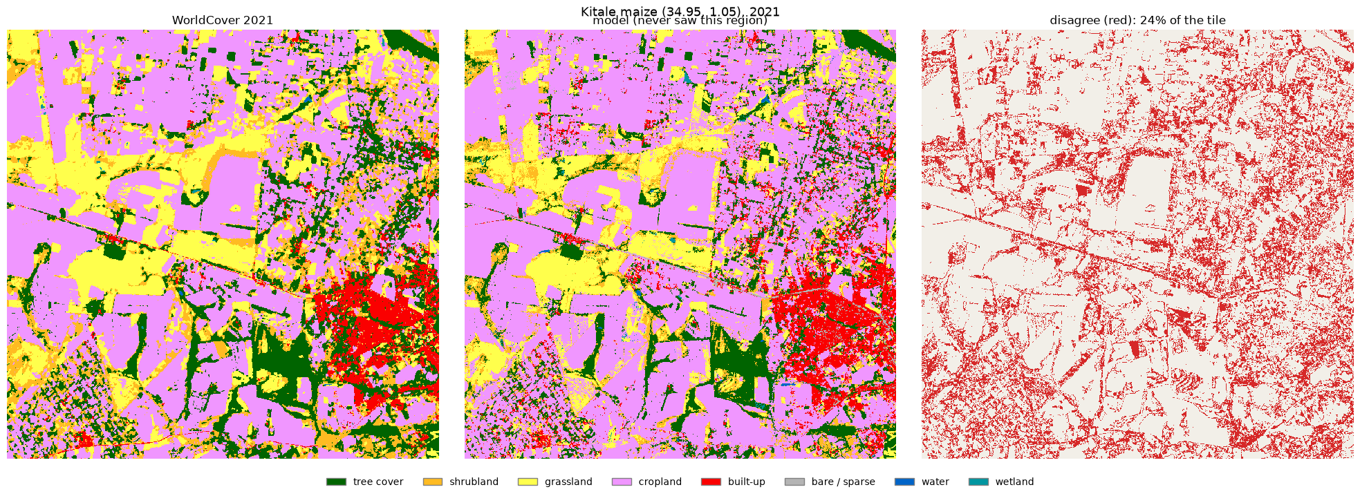
3. Train: put a small model on top. Embeddings work as features for an ordinary classifier. A plain logistic regression trained on ESA WorldCover labels [10] agreed with WorldCover 68.6% of the time in regions of Kenya it had never seen. For context, WorldCover is itself about 77% accurate globally [11], and it misses much of Kenya's cropland [12].
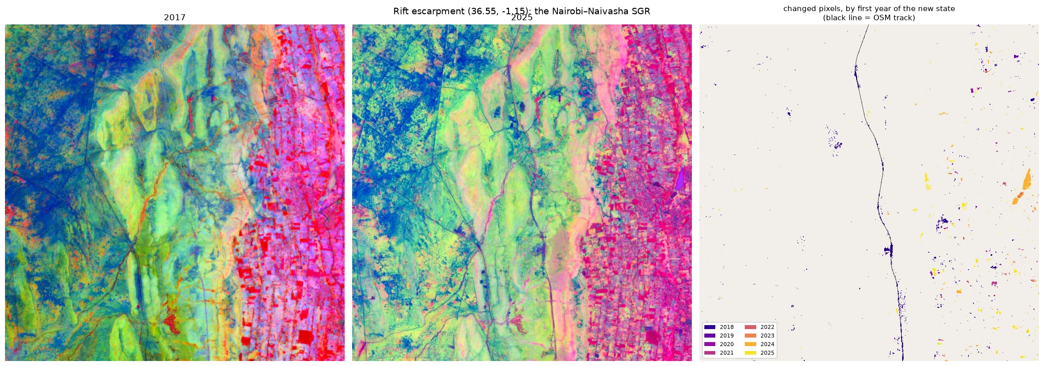
There is a bonus pattern too. Because every year has its own embedding, you can detect and date change. For each pixel, find the year its embedding changed most. The Nairobi–Naivasha railway lights up, with its changed pixels dated 2018–2019, matching its construction dates [13][14]. The older Mombasa–Nairobi line, which opened in 2017, stays quiet as it should: 2 changed pixels out of about 9,000.
Use case: measuring a rising lake
Lake Baringo is a freshwater lake in Kenya's Rift Valley. Since around 2010 it has been rising and pushing kilometres inland over farms, grazing land and homes. The rise was serious enough that the Kenyan Government commissioned an inquiry into the Rift Valley lakes, published in 2021 [15].
Everyone near the lake knows it grew. The harder questions are how much, where, and when. I set out to answer them for every year from 2017 to 2025, using only TESSERA.
Step 1: Two reference embeddings
I didn't train a classifier. Instead I built two reference embeddings from places whose identity isn't in doubt:
- Water: a tile of open Lake Victoria.
- Land: a tile of central Nairobi.
Each reference is the average of its tile's embeddings. Then every pixel around Baringo gets one question: is it closer, by cosine similarity, to water or to land?
Is that too simple to work? Two checks say it isn't:
- The water and land references have a cosine similarity of 0.42. Two unrelated land tiles 290 km apart score 0.74. Water is much further from land than two different landscapes are from each other.
- Applied pixel by pixel to Lake Turkana, with no smoothing, the test draws one clean shoreline. Noise can't produce a coherent coastline.
Both references come from 2024 and are reused for every year. The yardstick stays fixed, so the only thing that changes from year to year is the ground itself.
Step 2: One water map per year
The lake fits in a 3 × 3 block of tiles (about 33 × 33 km). That's 81 tile-years and about 13 GB. For each year, I:
- Classified every pixel as water or land.
- Reprojected all nine tiles onto one shared 10 m grid. The lake sits on the boundary between two UTM zones, so its tiles arrive in different projections.
- Kept the largest connected patch of water as "the lake", so that rivers and ponds don't inflate the area.
On a 10 m grid, each pixel covers 100 m², so the lake's area is just a pixel count.
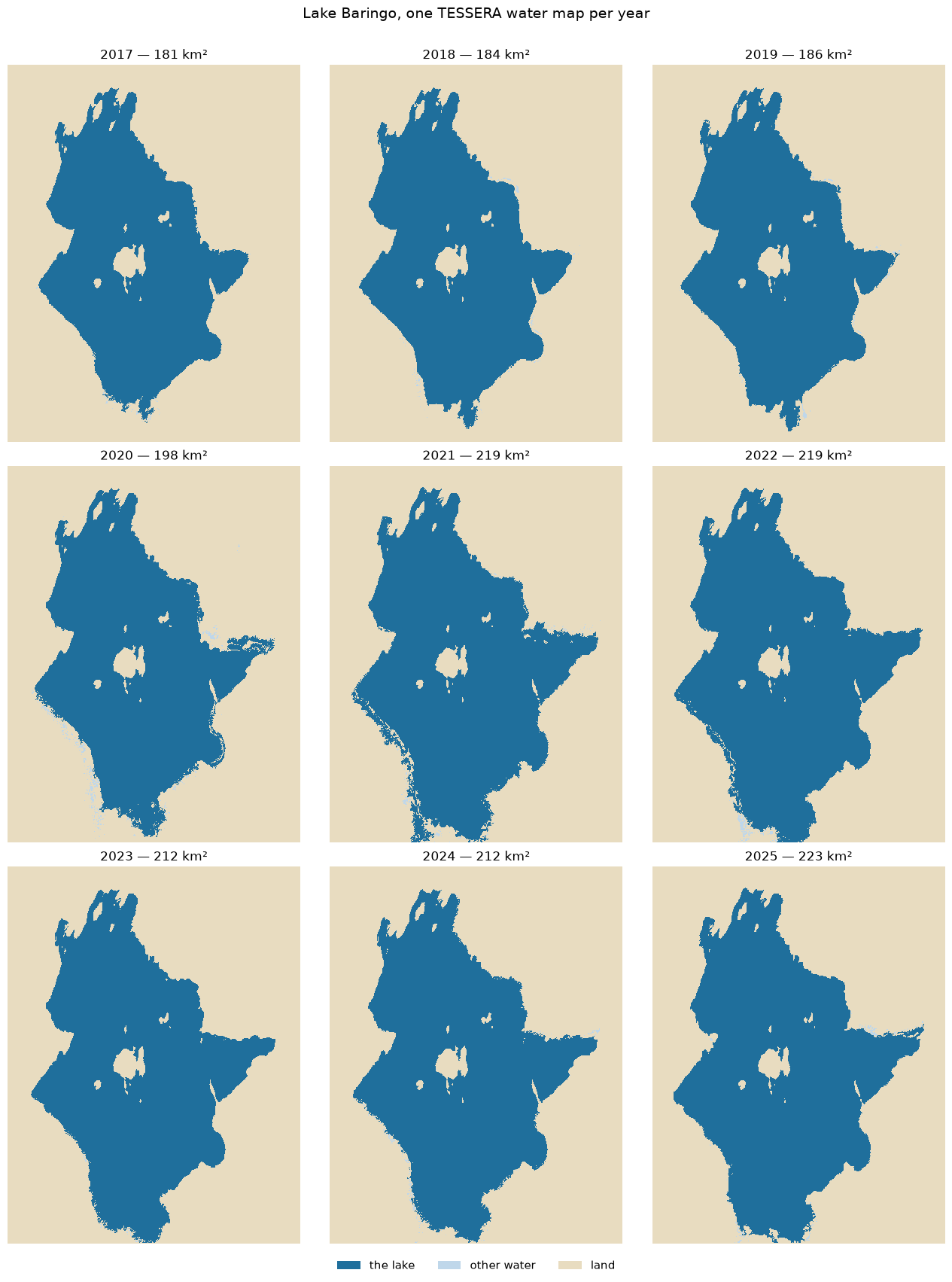
Result: the lake grew by 42 km²
Year   Area (km²)   Change
2017     181.3
2018     184.0       +2.7
2019     185.7       +1.7
2020     198.0      +12.4
2021     219.3      +21.3
2022     219.1       -0.2
2023     211.6       -7.5
2024     211.7       +0.2
2025     223.0      +11.3
The lake grew from 181 km² to 223 km², up 23%, but not steadily. It changed little until 2019, then grew 34 km² in 2020–2021. It dipped in 2023 and reached a new high in 2025.
Where and when the shoreline moved
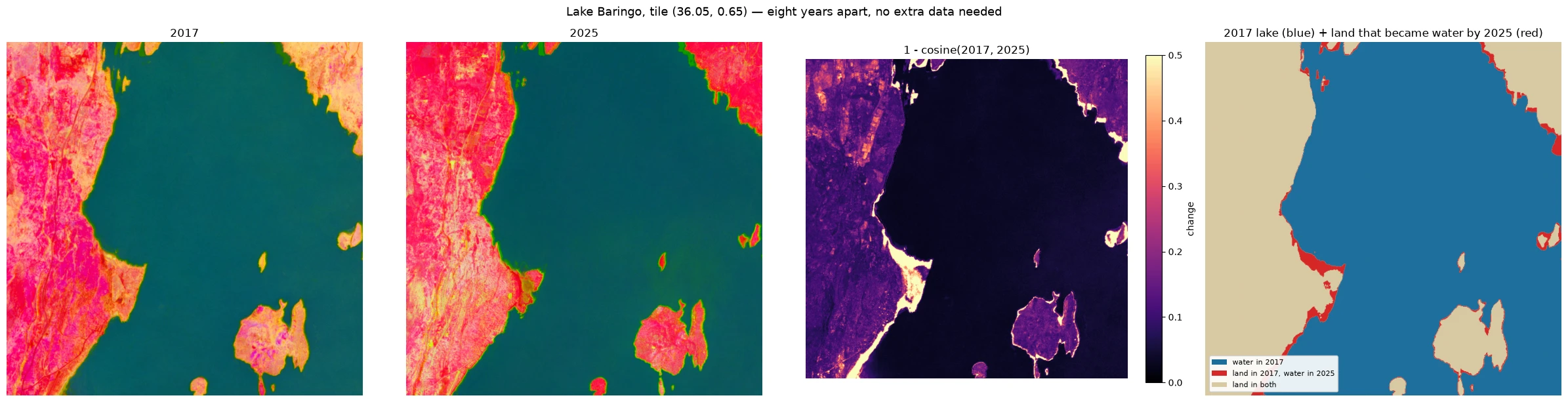
For every pixel that was land in 2017 and lake later, I recorded the first year it went under water.
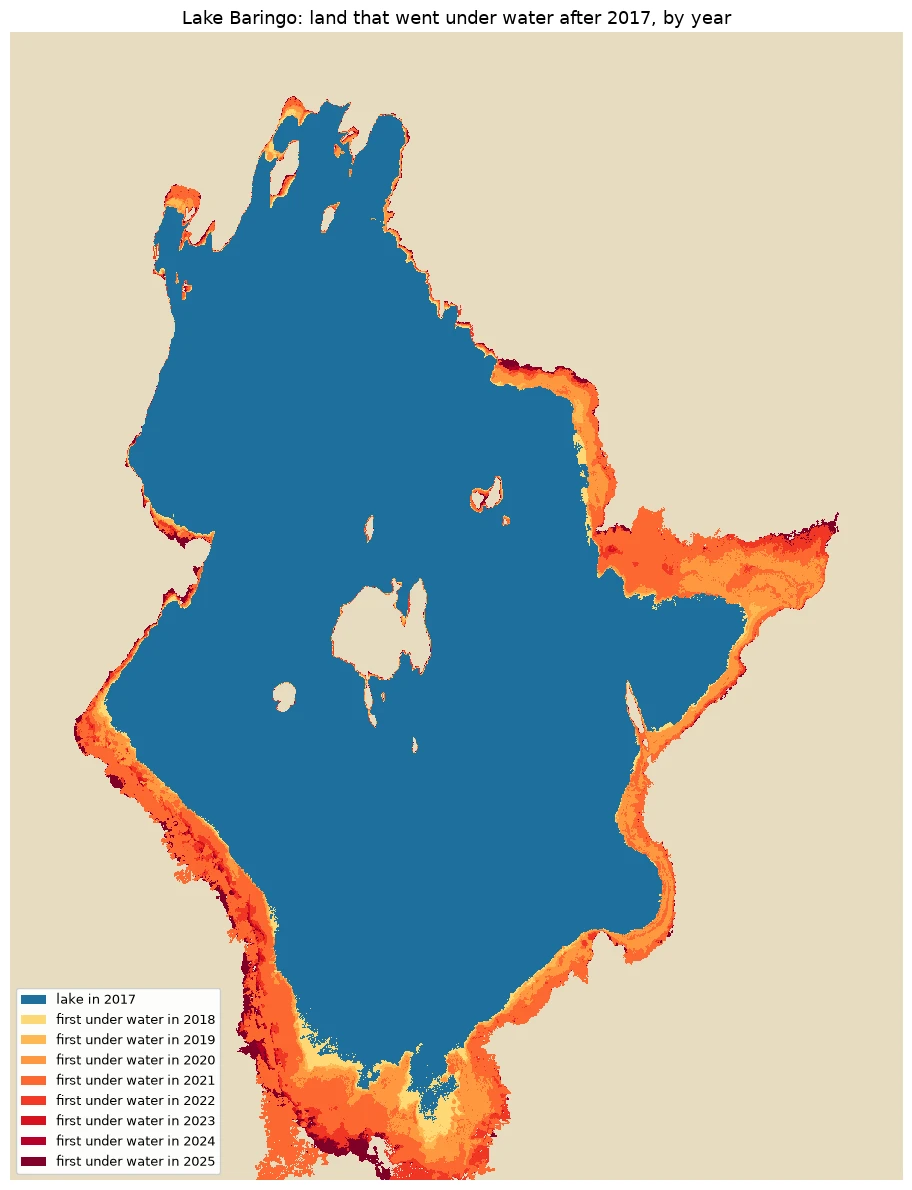
The new water forms continuous bands stepping outward year by year, not scattered pixels. That's what a real moving shoreline looks like. The widest bands are on the flat southern and eastern shores, where the same rise in water level covers the most ground.
- 45.9 km² of land went under water at least once.
- 31.3 km² went under and stayed under through 2025.
- 73% of all newly flooded land first went under in 2020 or 2021.
- None of the 2017 lake became land. The lake only moved outward.
Can we trust it?
Against published figures. For 2020, I measured 198 km². An independent Landsat study with GPS ground checks reported 209 km² [16], about 5% more. The 2021 government report gives 268 km² [15]. The two published figures disagree with each other by 28%, so the absolute area depends heavily on method. The size and timing of the rise are the most reliable part of my result.
Against itself. Each year is classified on its own, with no smoothing over time. If the method were noisy, pixels would flicker between water and land from year to year. They don't. 67% of the changing area switched exactly once and stayed switched. Pixels that flip five or more times, the signature of a noisy method, cover only 0.1 km².
Traps I ran into
These are the things I wish I had known on day one.
- The landmask removes the sea but not inland lakes. Pixels outside the landmask are 128 exact zeros, not NaN, so
np.isnanmisses them and averages quietly include them. Lake pixels, meanwhile, carry real embeddings. For a land study, averaging a lake tile gives a well-formed but meaningless number. For a lake study, it's exactly what you need. - "Similar" means "this kind of place", not "this category". Baringo's muddy water is only 0.45 similar to Lake Victoria's open water. A single "lake" fingerprint wouldn't find every lake. Comparing water versus land works; searching for water in general doesn't.
- Tile maths near the equator. Tiles are named by their centre. In floating point,
-1.30 / 0.1is-13.000000000000002, so a carelessfloorputs a point in the wrong tile. Half of Kenya has a negative latitude, so this bites often. - Mind the size. At about 163 MB per tile-year, a multi-year study grows fast. My nine-year Baringo study was 13 GB. Cache everything and never download a tile twice.
- Change dates pile up at the ends of the record. A change that happened before 2017, or is still under way, gets pushed to the first or last year. Dates in the middle years are the reliable ones.
Limitations
- Annual, not seasonal. Each embedding summarises a whole year, so you get annual extent, not the peak after the rains.
- Two classes only. Swamp, flooded grass and wet mud get pushed into "water" or "land". This probably explains why my lake area sits below the others.
- The record starts in 2017. Baringo began rising around 2010, so the first large phase is missing.
- It says nothing about what was lost. "Land" here means "not open water". Knowing whether the flooded land held farms, homes or grazing needs other data. That's my next step.
Why this matters
With TESSERA, two reference vectors and a cosine comparison were enough to measure a lake every year for nine years. They dated when each part of the shoreline went under and separated permanent flooding from temporary flooding. The result came within about 5% of an independent study that used ground checks.
I trained no model, labelled no data and processed no raw satellite imagery. For anyone working where labelled data is scarce, and in much of Africa it is, that matters. The heavy work of turning noisy, cloudy satellite time series into something usable has already been done. What is left is to ask good questions.
The same approach should work on Kenya's other Rift Valley lakes (Bogoria, Nakuru and Naivasha), which rose over the same period.
Code: all notebooks for this series, including the full Lake Baringo analysis, are on GitHub: planetary-ai-tessera-kenya.
References
- Feng, Z., Atzberger, C., Jaffer, S., Knezevic, J., Sormunen, S., Young, R., Lisaius, M.C., Immitzer, M., Jackson, T., Ball, J., Coomes, D.A., Madhavapeddy, A., Blake, A. & Keshav, S. (2026). TESSERA: Temporal Embeddings of Surface Spectra for Earth Representation and Analysis. CVPR 2026. arXiv: https://arxiv.org/abs/2506.20380
geotessera: Python library and data access for TESSERA embeddings. https://github.com/ucam-eo/geotessera- TESSERA model repository (licences and citation). https://github.com/ucam-eo/tessera
- Brown, C.F. et al. (2025). AlphaEarth Foundations: An embedding field model for accurate and efficient global mapping from sparse label data. https://arxiv.org/abs/2507.22291
- Google Earth Engine: Introduction to the Satellite Embedding Dataset. https://developers.google.com/earth-engine/tutorials/community/satellite-embedding-01-introduction
- Prithvi-EO-2.0: A Versatile Multi-Temporal Foundation Model for Earth Observation Applications. https://arxiv.org/abs/2412.02732
- Clay Foundation Model. https://github.com/Clay-foundation/model
- Exploring the potential of AlphaEarth and TESSERA embeddings for Fine-scale Local Climate Zone Mapping: A case study across five cities in Switzerland. https://arxiv.org/abs/2606.20034
- Planetary AI: TESSERA over Kenya (this series' notebooks). https://github.com/FathirAMM/planetary-ai-tessera-kenya
- ESA WorldCover 2021 v200. https://doi.org/10.5281/zenodo.7254221
- ESA WorldCover 2021 Product Validation Report v2.0. https://esa-worldcover.s3.eu-central-1.amazonaws.com/v200/2021/docs/WorldCover_PVR_V2.0.pdf
- Kerner, H. et al. (2024). How accurate are existing land cover maps for agriculture in Sub-Saharan Africa? https://arxiv.org/abs/2307.02575
- AidData: SGR Phase 2A (construction January 2018 to September 2019). https://china.aiddata.org/projects/47025/
- Kenya Standard Gauge Railway, Wikipedia (opening dates). https://en.wikipedia.org/wiki/Kenya_Standard_Gauge_Railway
- Tobiko, K. (2021). Rising Water Levels in Kenya's Rift Valley Lakes, Turkwel Gorge Dam and Lake Victoria. Government of Kenya and UNDP. Archived: https://web.archive.org/web/20220428030814/http://www.environment.go.ke/wp-content/uploads/2021/10/MENR_Scoping_Report_Latest-5-07-21.pdf
- Maina, G., Obulinji, H., Karanja, A. & Koech, H. (2026). A Rising Endorheic Lake: LULC Change and Water Surface Expansion at Lake Baringo, Kenya (1989–2020). East African Journal of Environment and Natural Resources, 9(3). https://doi.org/10.37284/eajenr.9.3.5277